Project Type
Project Type
Project Type
UX Case Study — Website Redesign
UX Case Study — Website Redesign
UX Case Study — Website Redesign
Role
Role
Role
UX Researcher, UI/UX Designer
UX Researcher, UI/UX Designer
UX Researcher, UI/UX Designer
Duration
Duration
Duration
8 days
8 days
8 days

OVERVIEW
PROJECT DETAILS
Redesigning the flight booking experience for one of Nigeria's busiest airlines.
Arik Air is West Africa's largest privately owned carrier, operating domestic and regional routes from its dual hubs at Lagos's Murtala Muhammed International Airport and Abuja's Nnamdi Azikiwe International Airport. With a fleet of 22 aircraft serving millions of Nigerian travellers each year, the airline's website is a critical transactional surface, yet the booking experience contained several friction points that made it unnecessarily slow and confusing for users of all technical ability levels.
This self-initiated case study covers the complete flight-booking flow redesign: from the landing page through search, seat selection, passenger details, payment, and final e-ticket confirmation.
PROBLEM
PROJECT DETAILS
A booking flow that works against its users.
A heuristic audit of the existing arikair.com website surfaced four specific usability failures that were compounding one another to create a slow, frustrating booking experience:
The date picker did not dismiss after a date was selected, forcing users to manually close it before they could proceed — adding an unnecessary tap and breaking expected interaction patterns.
The passenger selection area defaulted to zero for all traveller categories (adults, children, infants). Since the overwhelming majority of bookings are for a single adult, this meant every user had to adjust the count before searching, adding cognitive load and extra steps.
Important promotional content and instructional copy on the landing page was visually obscured by overlapping page elements — burying deals and guidance that could have aided decision-making.
There was no integrated way to book hotels, cabs, or explore destination activities — forcing users to leave the site mid-journey and breaking the travel planning flow entirely.
Redesigning the flight booking experience for one of Nigeria's busiest airlines.
Arik Air is West Africa's largest privately owned carrier, operating domestic and regional routes from its dual hubs at Lagos's Murtala Muhammed International Airport and Abuja's Nnamdi Azikiwe International Airport. With a fleet of 22 aircraft serving millions of Nigerian travellers each year, the airline's website is a critical transactional surface, yet the booking experience contained several friction points that made it unnecessarily slow and confusing for users of all technical ability levels.
This self-initiated case study covers the complete flight-booking flow redesign: from the landing page through search, seat selection, passenger details, payment, and final e-ticket confirmation.
Impact:
Booking friction on airline websites directly correlates with drop-off. Every unnecessary step or interaction blocker increases the likelihood a user abandons the booking and switches to a competing platform or third-party aggregator.
Impact:
Booking friction on airline websites directly correlates with drop-off. Every unnecessary step or interaction blocker increases the likelihood a user abandons the booking and switches to a competing platform or third-party aggregator.
OVERVIEW
USER PERSONAS
USER PERSONAS
USER PERSONAS
Two archetypes that shaped every decision:
Two archetypes that shaped every decision:
Arik Air Website Redesign: A UX Case Study

BEYONCÉ KALU, 36
Architect. Abuja, Nigeria
BEYONCÉ KALU, 36
Architect. Abuja, Nigeria
BEYONCÉ KALU, 36
Architect. Abuja, Nigeria
Gender: Female
Family: Married, 2 children
Travel: Very frequent traveller; at least 5 times monthly
Personality: Very tech savvy, mostly busy
Frustrations:
A number of unnecessary steps while booking flights.
Usually not sure what to do (where to go) during the extra time she has in the visiting cities.
Goals:
Go through the flight booking process with ease.
See suggestions on things to do, places to explore within cities.

ELON UDUMA, 29
Digital Communications Strategist. Enugu, Nigeria
ELON UDUMA, 29
Digital Communications Strategist. Enugu, Nigeria
ELON UDUMA, 29
Digital Communications Strategist. Enugu, Nigeria
Gender: Male
Family: Single, no child
Travel: Not frequent traveller; at most 2 times monthly
Personality: Not very tech savvy, very busy
Frustrations:
Too many steps involved in planning his trips.
Not very tech savvy - doesn't enjoy the process.
Goals:
Spend less time planning/booking his trips.
Easily sort out all (major) aspects of his travel, including movement, accommodation.
THE DESIGN PROCESS
THE DESIGN PROCESS
THE DESIGN PROCESS
Five-stage design thinking framework. The redesign followed a structured design thinking process:
Five-stage design thinking framework. The redesign followed a structured design thinking process:
Five-stage design thinking framework. The redesign followed a structured design thinking process:

ensuring every design decision was traceable back to a user need or validated insight, not visual preference.
ensuring every design decision was traceable back to a user need or validated insight, not visual preference.
ensuring every design decision was traceable back to a user need or validated insight, not visual preference.
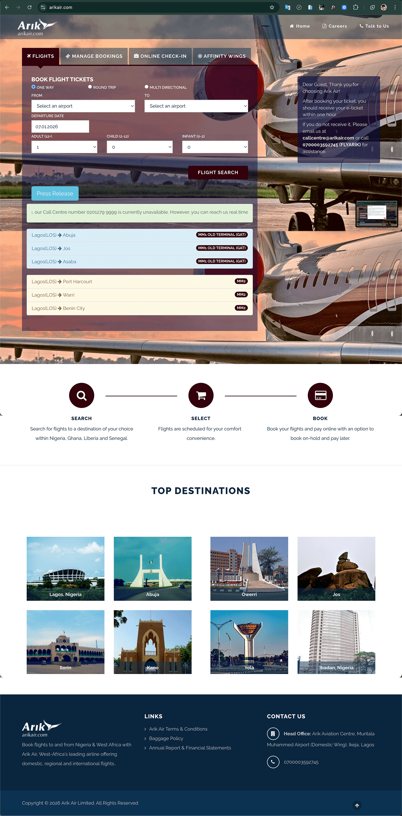
Arik Air's current landing page (https://arikair.com)
Arik Air's current landing page (https://arikair.com)
Arik Air's current landing page (https://arikair.com)
IDEATE — WIREFRAMES
IDEATE — WIREFRAMES
IDEATE — WIREFRAMES
Translating insights into interface structure.
Translating insights into interface structure.
Translating insights into interface structure.
With research findings defined, I moved into information architecture and wireframing, mapping out the revised booking flow before committing any visual decisions. Key structural changes included:
Auto-dismissing the date picker on selection, matching standard calendar interaction patterns across the web.
Defaulting the passenger count to 1 adult; reflecting the most common booking scenario and saving the majority of users a manual step.
Surfacing promotional content above the fold and removing element overlap that was burying key information.
Introducing a 'Hotels, Cabs & Places' tab into the primary navigation; allowing destination planning to happen in the same session without leaving the airline's ecosystem.
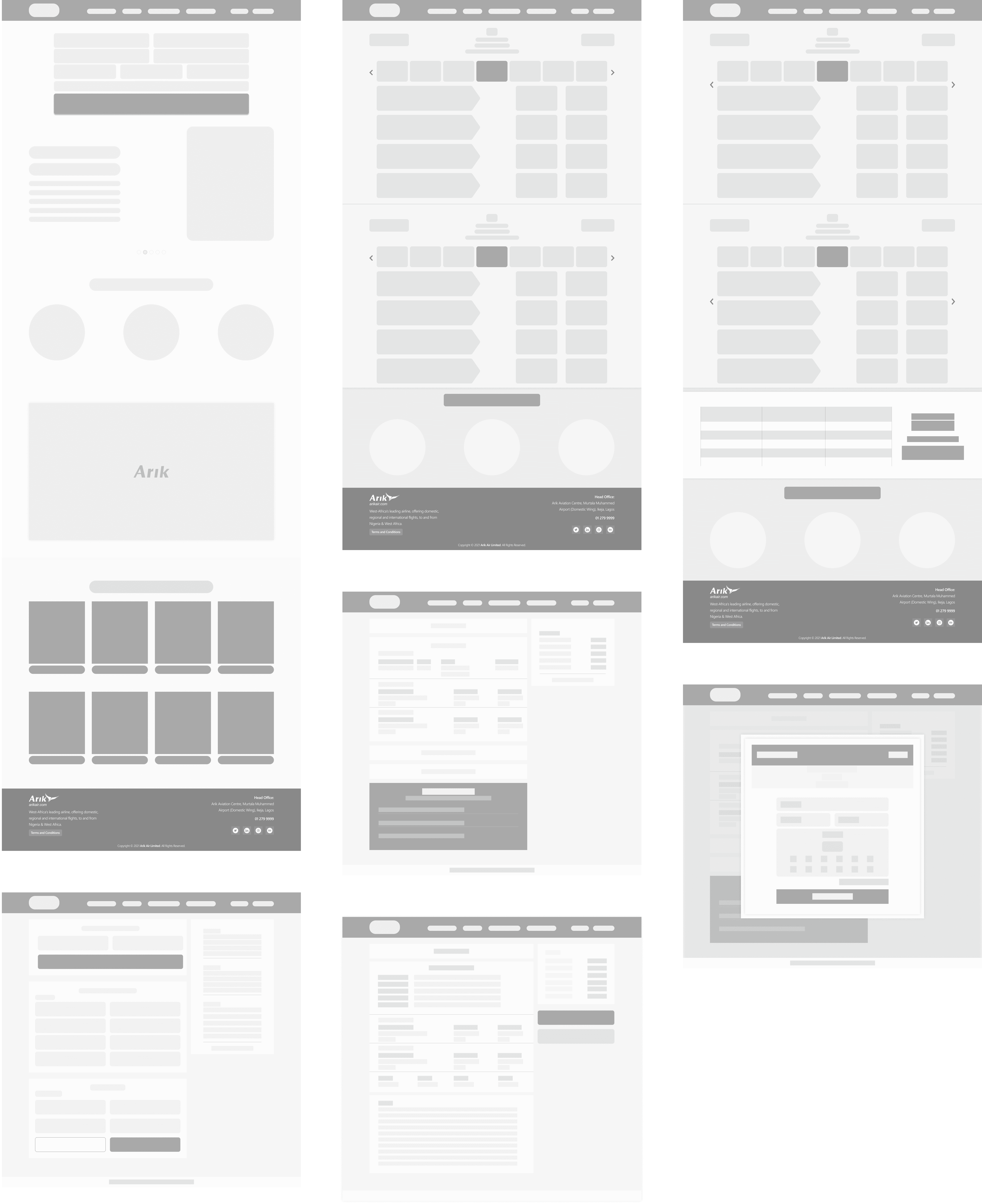
Wireframes
Wireframes
Wireframes
SOLUTION
SOLUTION
SOLUTION
A faster, more contextual booking flow
A faster, more contextual booking flow
A faster, more contextual booking flow
The high-fidelity redesign introduced a cleaner visual hierarchy, a consolidated booking widget, and a new destination content layer — delivering improvements across the full funnel from landing page through to e-ticket.
The high-fidelity redesign introduced a cleaner visual hierarchy, a consolidated booking widget, and a new destination content layer — delivering improvements across the full funnel from landing page through to e-ticket.
The high-fidelity redesign introduced a cleaner visual hierarchy, a consolidated booking widget, and a new destination content layer — delivering improvements across the full funnel from landing page through to e-ticket.
HIGH FIDELITY MOCKUPS
HIGH FIDELITY MOCKUPS
HIGH FIDELITY MOCKUPS
Going from the result of our earlier conducted surveys, we will discover that users want a flight-booking system that saves them time and also solves some of their other travel-related needs.
Going from the result of our earlier conducted surveys, we will discover that users want a flight-booking system that saves them time and also solves some of their other travel-related needs.
Going from the result of our earlier conducted surveys, we will discover that users want a flight-booking system that saves them time and also solves some of their other travel-related needs.
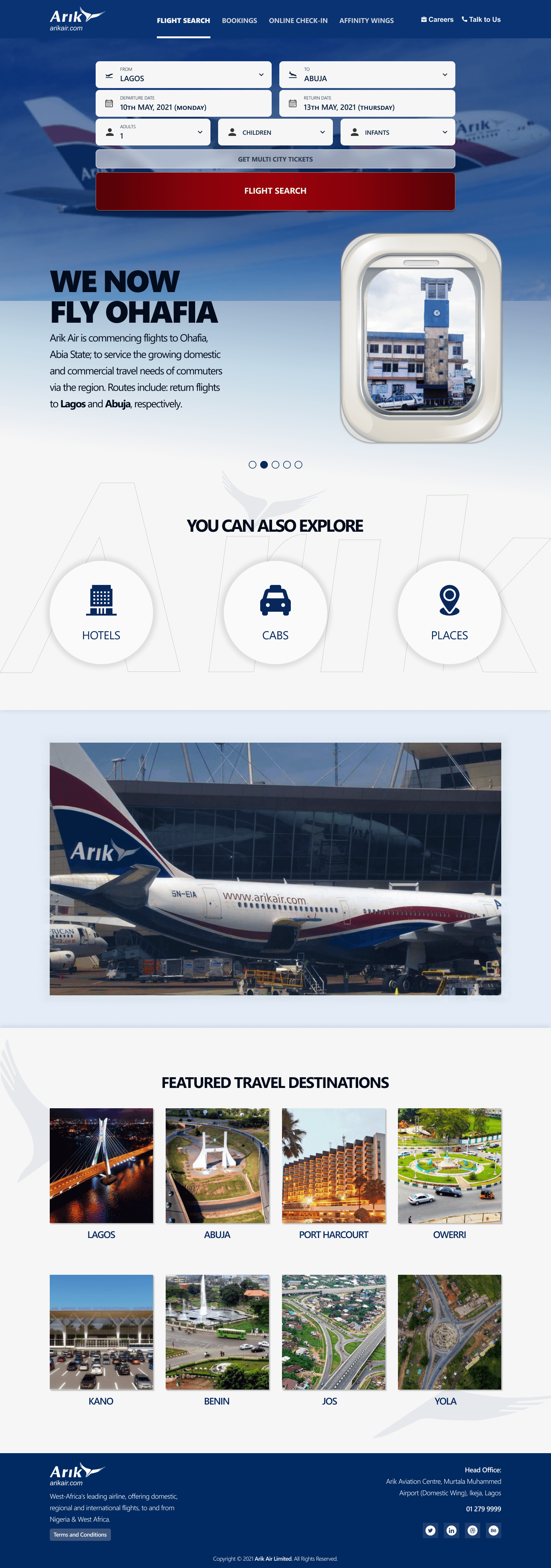
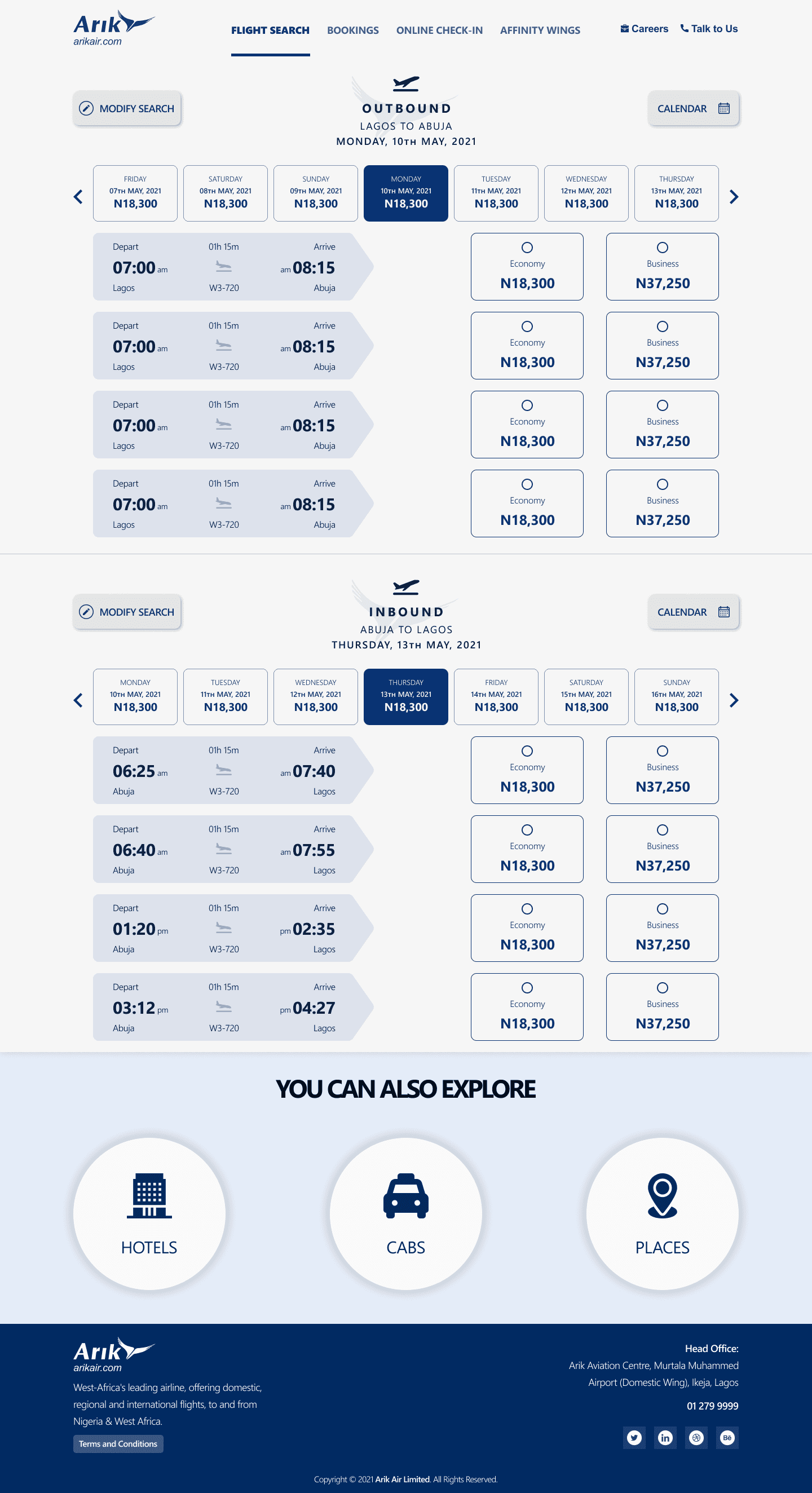
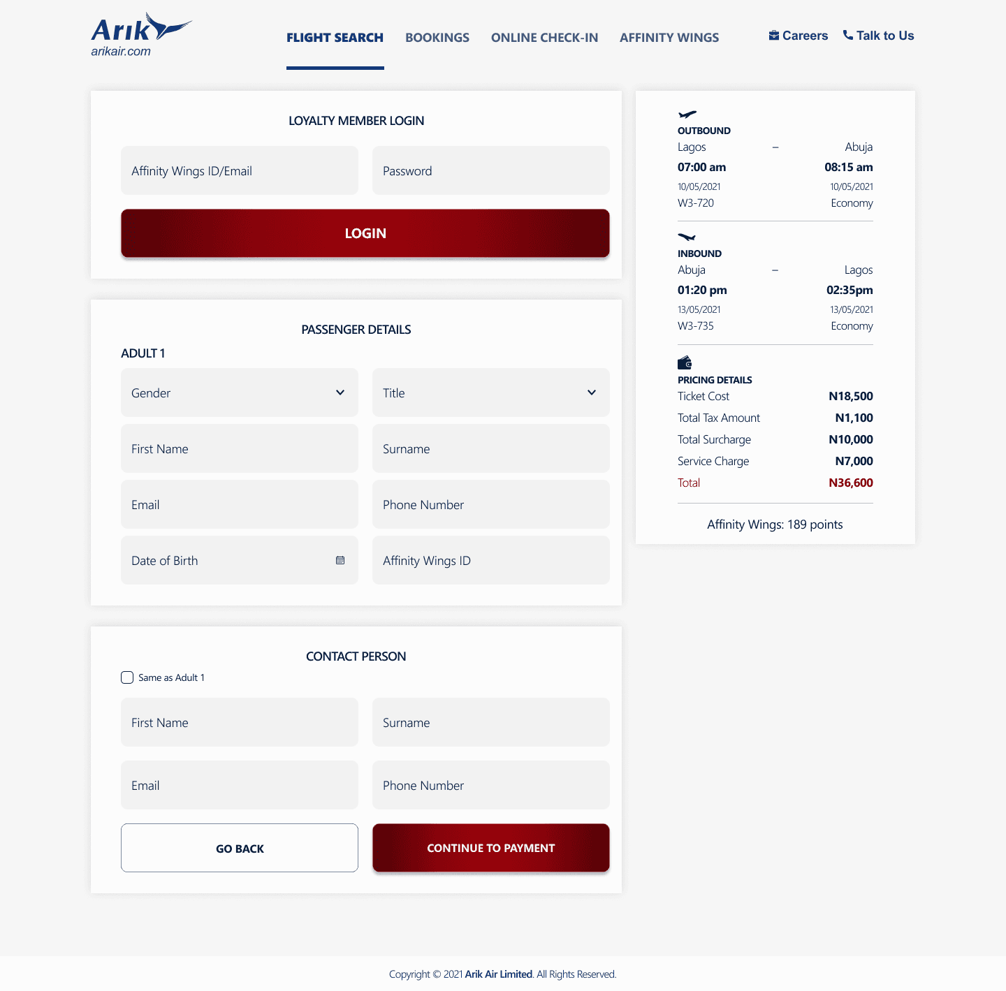
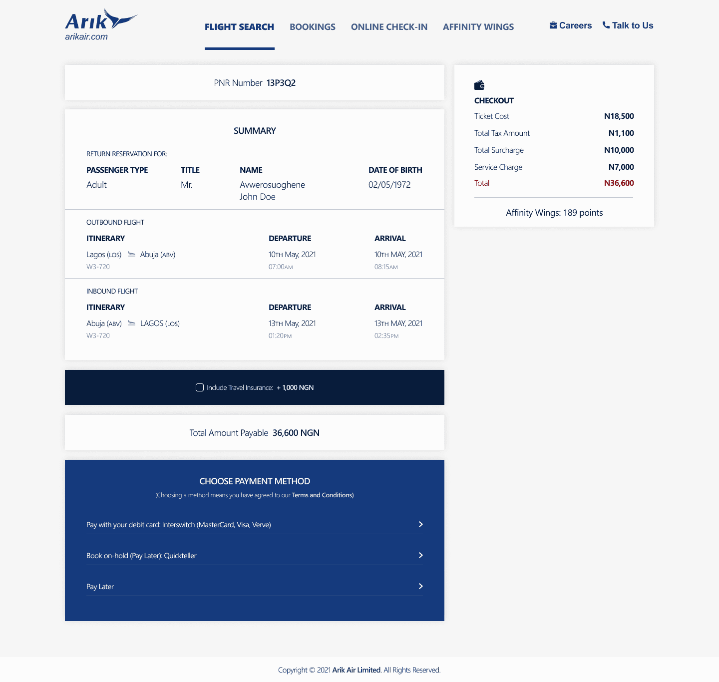
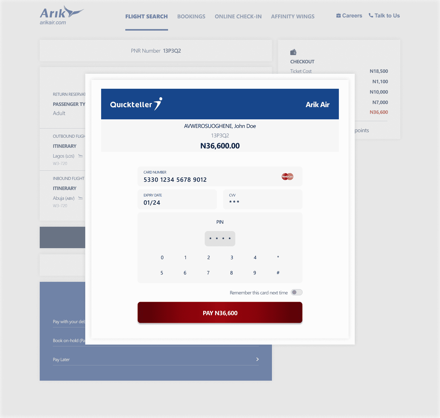
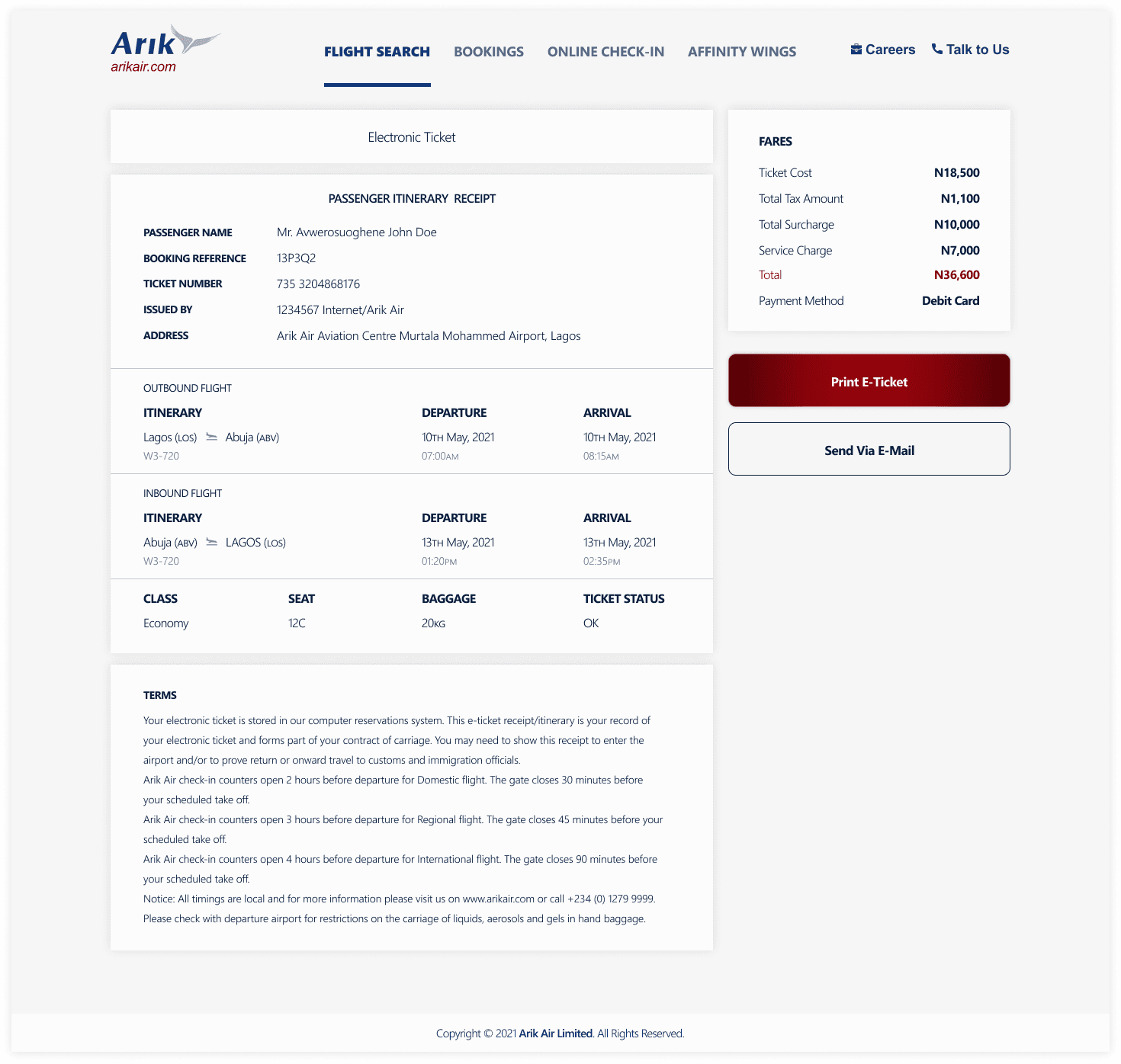
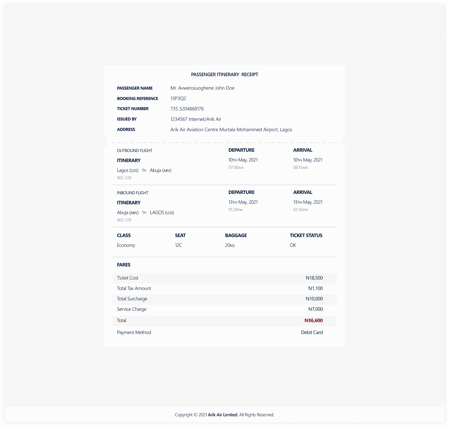
High-Fidelity Mockups
High-Fidelity Mockups
High-Fidelity Mockups
USER TESTING
USER TESTING
USER TESTING
Validating against four (4) quality criteria
Validating against four (4) quality criteria
Validating against four (4) quality criteria
The redesigned flow was tested against four criteria: Usability (ease of use), Learnability (how quickly users understood the interface), Satisfaction (subjective experience quality), and Efficiency (time to complete booking). Key outcomes:
Participants consistently completed their bookings faster than on the original site, with fewer backward navigations and recovery actions.
Screen layouts received positive feedback for clarity: users could orient themselves quickly at each step without needing to scan the full page.
The integrated hotels and cabs section was a standout discovery: users who had previously relied on separate apps expressed that this alone would be a reason to use the airline's website over an aggregator.
Overall satisfaction scores were meaningfully higher than baseline; participants described the redesigned experience as more trustworthy — a critical signal for a payments-heavy flow.
REFLECTION
REFLECTION
REFLECTION
What I would explore further
What I would explore further
What I would explore further
Given more time and access to live analytics, I would investigate drop-off rates at each step of the existing funnel, run A/B tests on the new default passenger count, and conduct accessibility audits to ensure the redesigned components meet WCAG 2.1 AA standards; an area where Nigerian digital products still frequently fall short. The destination content layer (hotels, cabs, places) also presents an interesting product expansion opportunity worth deeper exploration as a potential revenue stream for the airline.
Given more time and access to live analytics, I would investigate drop-off rates at each step of the existing funnel, run A/B tests on the new default passenger count, and conduct accessibility audits to ensure the redesigned components meet WCAG 2.1 AA standards; an area where Nigerian digital products still frequently fall short. The destination content layer (hotels, cabs, places) also presents an interesting product expansion opportunity worth deeper exploration as a potential revenue stream for the airline.
Given more time and access to live analytics, I would investigate drop-off rates at each step of the existing funnel, run A/B tests on the new default passenger count, and conduct accessibility audits to ensure the redesigned components meet WCAG 2.1 AA standards; an area where Nigerian digital products still frequently fall short. The destination content layer (hotels, cabs, places) also presents an interesting product expansion opportunity worth deeper exploration as a potential revenue stream for the airline.
CONCLUSION
CONCLUSION
Being an industry I have always had interested in, working on this case study for a major player in the Nigerian aviation sector has been an utter delight for me. I figured, evaluating the website of a Nigerian-based airline wasn't a bad idea. After all, where do they say charity begins?
This design is an improvement on the current experience of users on the website; it also gives the airline a better online presence, which would, on a medium-/long-term basis, help the airline meet its business goals, as well as scale up its revenue stream, via this channel.
Thank you for your time 🫶.
PROBLEM
A booking flow that works against its users.
A heuristic audit of the existing arikair.com website surfaced four specific usability failures that were compounding one another to create a slow, frustrating booking experience:
The date picker did not dismiss after a date was selected, forcing users to manually close it before they could proceed — adding an unnecessary tap and breaking expected interaction patterns.
The passenger selection area defaulted to zero for all traveller categories (adults, children, infants). Since the overwhelming majority of bookings are for a single adult, this meant every user had to adjust the count before searching, adding cognitive load and extra steps.
Important promotional content and instructional copy on the landing page was visually obscured by overlapping page elements — burying deals and guidance that could have aided decision-making.
There was no integrated way to book hotels, cabs, or explore destination activities — forcing users to leave the site mid-journey and breaking the travel planning flow entirely.
Impact:
Booking friction on airline websites directly correlates with drop-off. Every unnecessary step or interaction blocker increases the likelihood a user abandons the booking and switches to a competing platform or third-party aggregator.
Impact:
Booking friction on airline websites directly correlates with drop-off. Every unnecessary step or interaction blocker increases the likelihood a user abandons the booking and switches to a competing platform or third-party aggregator.
PROBLEM
Impact:
Booking friction on airline websites directly correlates with drop-off. Every unnecessary step or interaction blocker increases the likelihood a user abandons the booking and switches to a competing platform or third-party aggregator.
Impact:
Booking friction on airline websites directly correlates with drop-off. Every unnecessary step or interaction blocker increases the likelihood a user abandons the booking and switches to a competing platform or third-party aggregator.
Let's Build Something Great Together
Whether you have a role in mind or just want to connect, I would love to hear from you.
Get in touch
Let's Build Something Great Together
Whether you have a role in mind or just want to connect, I would love to hear from you.
Get in touch
Let's Build Something Great Together
Whether you have a role in mind or just want to connect, I would love to hear from you.
Get in touch