Project Type
Project Type
Project Type
UI/UX Design — Mobile App
UI/UX Design — Mobile App
UI/UX Design — Mobile App
Role
Role
Role
UI/UX Designer
UI/UX Designer
UI/UX Designer
Duration
Duration
Duration
8 days
8 days
8 days
OVERVIEW
OVERVIEW
Designing for a New Paradigm of Financial Control
Decentralized exchanges (DEXes) represent one of the most significant shifts in how people interact with financial assets. Unlike centralized exchanges which act as intermediaries holding user funds and verifying trades, a DEX operates entirely on blockchain technology through smart contracts, enabling peer-to-peer trading where users retain full custody of their assets at all times.
This project involved designing the mobile UI for a DEX application: a product that needed to make a technically complex, often intimidating category of finance feel accessible, trustworthy, and intuitive, without over-simplifying to the point of removing the control and transparency that defines the category's core value proposition.
Design Challenge
DEX products sit at a tension point: their primary audience (crypto-native users) values density, control, and technical transparency, but the long-term growth of the category depends on reaching users who are less familiar with blockchain concepts. The design had to serve both without compromising either.
PROBLEM
PROBLEM
Complexity Without Clarity Is a Barrier to Adoption
Many DEX interfaces, at the time of this project, were designed by and for developers; feature-rich but visually chaotic, with dense data tables, unclear terminology, and interaction patterns that offered no guidance to newcomers. The resulting experience communicated sophistication but not usability, which actively slowed adoption outside of crypto-native circles.
The design challenge was to create an interface that:
Made it immediately clear what a user can do and how to do it: buy, sell, and swap digital assets directly from a connected wallet.
Surfaced the most relevant data (token prices, portfolio value, transaction history) without overwhelming users with raw blockchain data they don't yet need.
Built trust through visual consistency and clear state communication; especially for transactions, where users are interacting with real financial assets and expect explicit confirmation at every step.
Worked within the constraints of a mobile-first form factor, where screen real estate is limited but user attention is even more so.
DESIGN APPROACH
DESIGN APPROACH
Layered Complexity — Simple on Entry, Powerful on Depth
The core design philosophy was progressive disclosure: exposing enough information to guide action at each step, while making deeper data (slippage tolerance, gas fees, liquidity depth) accessible to users who want it without forcing it on those who don't.
Key design decisions:
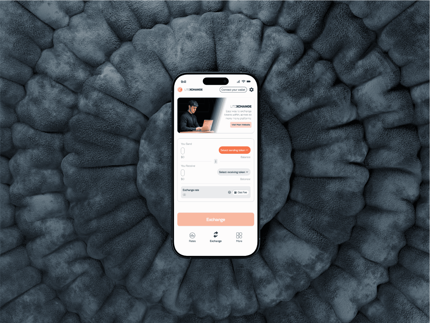
A clean home screen that leads with portfolio value and quick-action buttons: buy, sell, swap; rather than starting with a raw token list. This mirrors the mental model of 'what can I do' rather than 'what data exists'.
Token selection and swap screens designed with search-first navigation, reducing the cognitive load of browsing a long list of assets without context.
A transaction confirmation screen that clearly summarises the full trade: input amount, output amount, exchange rate, and estimated fees, before any irreversible blockchain action is taken. In DeFi, a missed confirmation step means lost funds; the design treats this screen with appropriate weight.
A dark-mode-first visual language: consistent with crypto product conventions, better for extended use sessions, and visually distinct from traditional banking apps; reinforcing the product's identity as something new.
Portfolio and transaction history screens designed with clean data hierarchy; recent activity surfaced first, with clear iconography distinguishing send, receive, and swap actions.
Layered Complexity — Simple on Entry, Powerful on Depth
The core design philosophy was progressive disclosure: exposing enough information to guide action at each step, while making deeper data (slippage tolerance, gas fees, liquidity depth) accessible to users who want it without forcing it on those who don't.
Key design decisions:
A clean home screen that leads with portfolio value and quick-action buttons: buy, sell, swap; rather than starting with a raw token list. This mirrors the mental model of 'what can I do' rather than 'what data exists'.
Token selection and swap screens designed with search-first navigation, reducing the cognitive load of browsing a long list of assets without context.
A transaction confirmation screen that clearly summarises the full trade: input amount, output amount, exchange rate, and estimated fees, before any irreversible blockchain action is taken. In DeFi, a missed confirmation step means lost funds; the design treats this screen with appropriate weight.
A dark-mode-first visual language: consistent with crypto product conventions, better for extended use sessions, and visually distinct from traditional banking apps; reinforcing the product's identity as something new.
Portfolio and transaction history screens designed with clean data hierarchy; recent activity surfaced first, with clear iconography distinguishing send, receive, and swap actions.

DESIGN CONSIDERATIONS
DESIGN CONSIDERATIONS
DESIGN CONSIDERATION
Designing for Trust in a Trustless System
One of the defining UX challenges of DeFi products is that their technical underpinning : smart contracts with no intermediary. That means there is no customer service to call and no 'undo' button after a transaction is confirmed. This places an unusual responsibility on the UI to be unambiguous. Every label, every confirmation state, and every error message was written and structured with this constraint in mind.
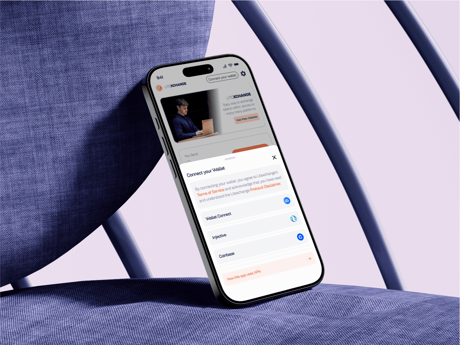
Wallet connection: the first action a user takes in a DEX was also treated as a moment of trust-building: clear iconography, recognisable wallet options (MetaMask, WalletConnect), and reassuring copy about what the connection does and does not grant access to.
Designing for Trust in a Trustless System
One of the defining UX challenges of DeFi products is that their technical underpinning : smart contracts with no intermediary. That means there is no customer service to call and no 'undo' button after a transaction is confirmed. This places an unusual responsibility on the UI to be unambiguous. Every label, every confirmation state, and every error message was written and structured with this constraint in mind.
Wallet connection: the first action a user takes in a DEX was also treated as a moment of trust-building: clear iconography, recognisable wallet options (MetaMask, WalletConnect), and reassuring copy about what the connection does and does not grant access to.


OUTCOME
OUTCOME
OUTCOME
A Mobile DEX Experience That Respects Both User Types
The completed design delivers a mobile DEX interface that functions as an entry point for users new to decentralized finance while providing the depth and control that experienced users expect. The visual system is coherent, the core flows are navigable without prior crypto knowledge, and the transaction confirmation experience is robust enough to reduce the risk of user error.
Let's Build Something Great Together
Whether you have a role in mind or just want to connect, I would love to hear from you.
Get in touch
Let's Build Something Great Together
Whether you have a role in mind or just want to connect, I would love to hear from you.
Get in touch
Let's Build Something Great Together
Whether you have a role in mind or just want to connect, I would love to hear from you.
Get in touch