Project Type
Project Type
Project Type
Self-Initiated UI Redesign — Mobile App
Self-Initiated UI Redesign — Mobile App
Self-Initiated UI Redesign — Mobile App
Role
Role
Role
UI/UX Designer
UI/UX Designer
UI/UX Designer
Duration
Duration
Duration
1 day sprint
1 day sprint
1 day sprint
OVERVIEW
OVERVIEW
OVERVIEW
A Rapid Design Sprint to Clarify a Bank's First Impression
ProvidusBank is a Nigerian commercial bank positioning itself as a forward-thinking, technology-led institution; a go-to banking partner for fintechs, SMEs, and digital-native consumers. The bank's tagline, 'Future Forward Banking,' signals an ambition to be seen as a digital-first organisation, making the quality of its mobile app onboarding experience a critical brand expression, not just a functional gate.
This project was a focused, time-boxed redesign sprint: one day to audit the existing onboarding screens and produce a cleaner, more coherent alternative. The constraint was intentional. Rapid redesign exercises are a common format in design assessments and professional sprints, and they test a different skill set than open-ended projects: the ability to prioritise ruthlessly, make confident decisions quickly, and deliver a coherent output under pressure.
Design Sprint Context
One-day redesigns are a different exercise to full design engagements. The goal is not to solve every problem; it is to identify the highest-leverage improvements and execute them with enough quality to communicate a credible design direction.
Design Sprint Context
One-day redesigns are a different exercise to full design engagements. The goal is not to solve every problem; it is to identify the highest-leverage improvements and execute them with enough quality to communicate a credible design direction.
Design Sprint Context
One-day redesigns are a different exercise to full design engagements. The goal is not to solve every problem; it is to identify the highest-leverage improvements and execute them with enough quality to communicate a credible design direction.
PROBLEM
PROBLEM
PROBLEM
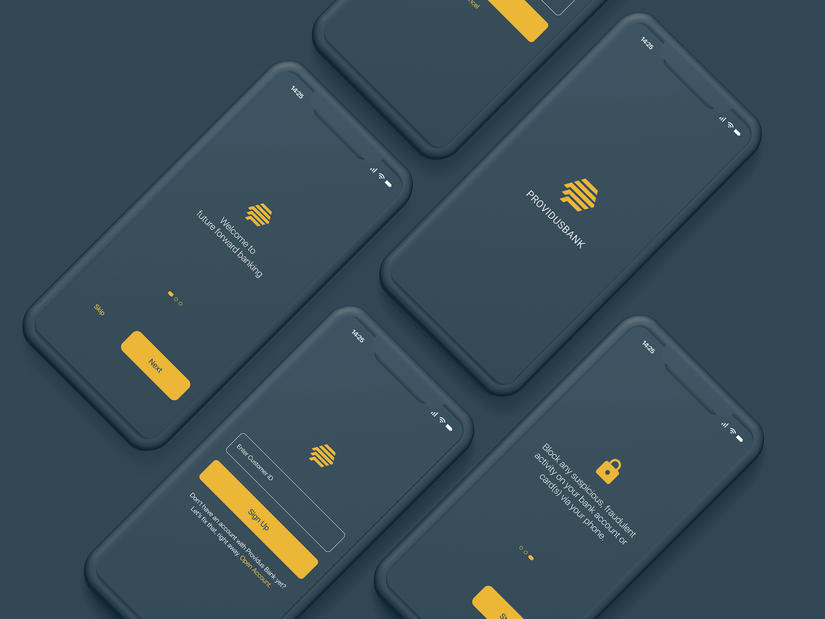
A Mismatch Between Brand Promise and Product Experience
'Future Forward Banking' sets a high expectation. The existing ProvidusPlus app onboarding did not fully meet it. Public App Store and Play Store feedback at the time flagged recurring issues: login errors after successful registration, confusing error states, and a signup flow that felt longer and more fragmented than the task required. Beyond functional bugs (outside the scope of a UI redesign), the visual execution of the onboarding screens reflected an earlier era of mobile design; one that predated the cleaner, more purposeful aesthetic that users now associate with modern digital banking.
The specific design-layer issues identified through heuristic audit:
Inconsistent visual hierarchy: primary actions (buttons, CTAs) were not always visually dominant, making the 'next step' ambiguous on several screens.
Typography choices created unnecessary visual noise: multiple weights, sizes, and styles used within single screens without a coherent system underpinning them.
Colour application was inconsistent: the brand's colour palette was applied unevenly, undermining the sense of a unified, considered product.
Spacing and layout rhythm were irregular across screens: elements felt placed rather than designed, suggesting the screens were built incrementally rather than from a shared visual foundation.
DESIGN APPROACH
DESIGN APPROACH
DESIGN APPROACH
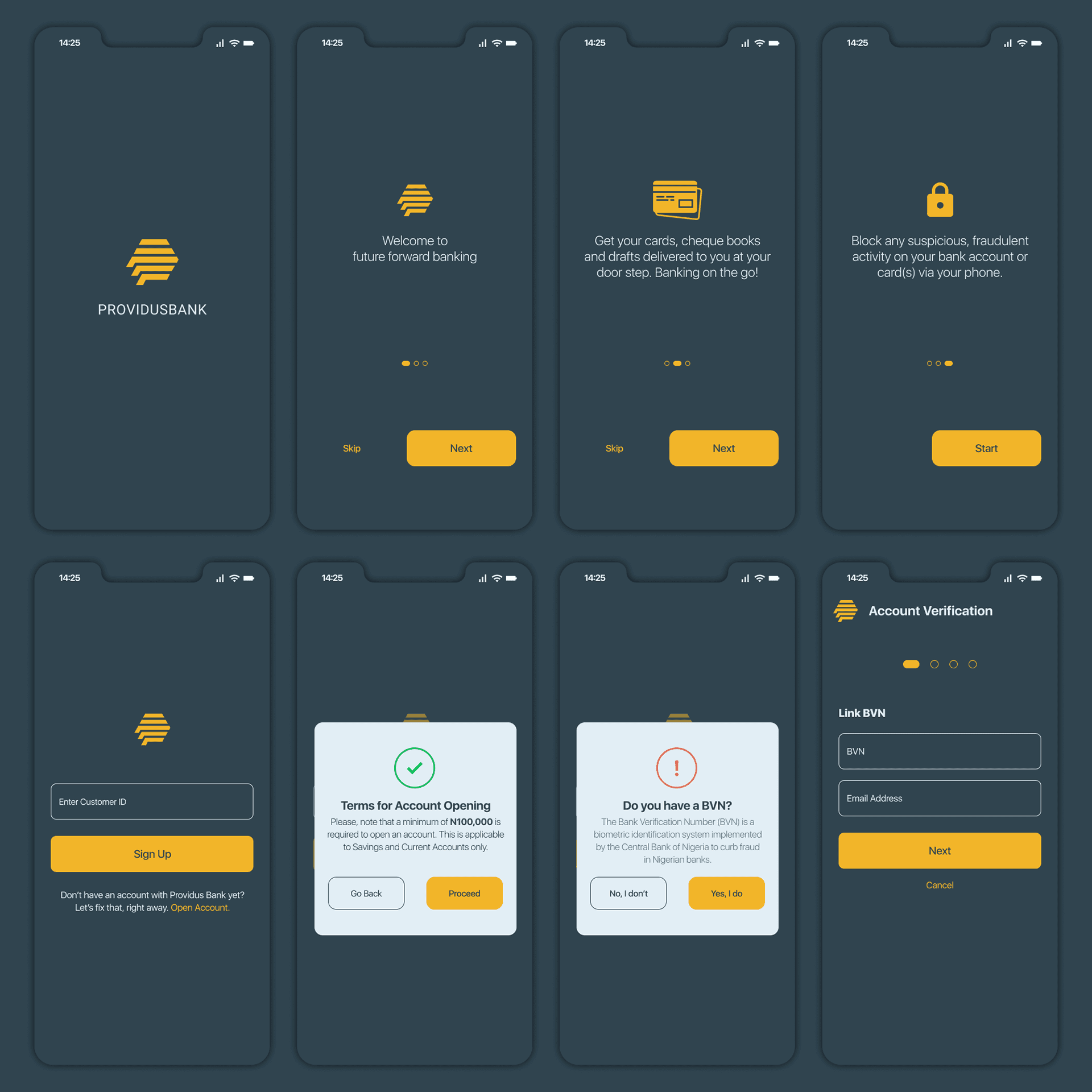
Hierarchy, Consistency, and Intentional Restraint
With a single day to work, the approach was surgical rather than wholesale. Rather than reimagining the onboarding flow's structure, which would require user research and stakeholder input beyond the scope of this sprint. I focused entirely on the visual execution layer: typography, colour, spacing, component consistency, and hierarchy.
Key decisions made in the sprint:
Established a clear typographic hierarchy across all screens: one dominant headline, one supporting body size, one caption/label size, applied consistently from screen to screen so users build visual familiarity quickly.
Rationalised colour application to reserve the primary brand colour for CTAs and active states, preventing it from competing with content and reinforcing its role as an action signal.
Rebuilt spacing rhythm using an 8pt grid system; bringing predictability and visual calm to layouts that had previously felt dense and inconsistent.
Redesigned input field states (default, focused, error, success) with clear visual differentiation: addressing one of the most-reported pain points from real users who described unclear feedback during form completion.
Simplified the visual language of the progress/step indicator: making the user's position in the onboarding sequence immediately readable at a glance.
OUTCOME
OUTCOME
OUTCOME
Design That Earns the 'Future Forward' Label
The redesigned onboarding screens deliver a visual experience more consistent with ProvidusBank's brand positioning: clean, confident, and purposefully modern. The improvements are not cosmetic; clearer hierarchy directly reduces the cognitive effort required at each step, and consistent component styling builds the visual trust that banking apps depend on.
This project also demonstrates a practical skill that is often undervalued in portfolios: the ability to improve what exists, not just design from scratch. Most real-world product design work involves iterating within constraints; fixing, refining, and elevating existing products rather than building new ones. This sprint is evidence of that capability.
REFLECTION
REFLECTION
REFLECTION
What a Longer Engagement Would Unlock
In a full project, the onboarding redesign would be preceded by user interviews and analytics review to understand where drop-offs occur in the existing flow, and followed by usability testing to validate that the redesigned screens actually perform better. A one-day sprint can identify the right design direction; rigorous testing is what confirms it. For ProvidusBank specifically, I would also explore the accessibility layer: App Store reviews flagged that screen reader users were effectively locked out of the app, a significant gap for a bank with 'inclusive banking' aspirations.
Let's Build Something Great Together
Whether you have a role in mind or just want to connect, I would love to hear from you.
Get in touch
Let's Build Something Great Together
Whether you have a role in mind or just want to connect, I would love to hear from you.
Get in touch
Let's Build Something Great Together
Whether you have a role in mind or just want to connect, I would love to hear from you.
Get in touch