Project Type
Project Type
Card Control Dashboard, Banking as a Service
Card Control Dashboard, Banking as a Service
Role
Role
Role
Product Designer
Product Designer
Duration
Duration
Duration
5 days
5 days
OVERVIEW
OVERVIEW
OVERVIEW
Relo is a financial infrastructure and Banking-as-a-Service (BaaS) platform that provides businesses with powerful APIs and developer tools to embed financial features directly into their own products; including digital wallets, card issuing, instant payouts, and compliant user onboarding.
This project focused on designing the Card Control Dashboard; an internal B2B interface that allows business managers to oversee and manage company-issued corporate cards. The challenge was to take a complex, high-stakes financial management tool and make it feel intuitive, trustworthy, and efficient for a non-technical business user.
Relo is a financial infrastructure and Banking-as-a-Service (BaaS) platform that provides businesses with powerful APIs and developer tools to embed financial features directly into their own products; including digital wallets, card issuing, instant payouts, and compliant user onboarding.
This project focused on designing the Card Control Dashboard; an internal B2B interface that allows business managers to oversee and manage company-issued corporate cards. The challenge was to take a complex, high-stakes financial management tool and make it feel intuitive, trustworthy, and efficient for a non-technical business user.
PROBLEM
PROBLEM
PROBLEM
Businesses that issue corporate cards to employees and contractors face a recurring challenge: visibility and control. As a company scales and the number of issued cards grows, managing spend, enforcing limits, and responding to suspicious activity becomes increasingly difficult without the right tools.
A business manager overseeing multiple corporate cards needs to:
Know the status of every card at a glance
Act quickly when something looks wrong
Adjust spending controls without friction
Trust that the platform will behave predictably in high-stakes moments
Without a well-designed dashboard, managers are left navigating fragmented information, making reactive decisions with incomplete context, and losing valuable time to tasks that should take seconds.
The core design challenge was clear: how do you give a business manager full control over their company's cards without overwhelming them with complexity?
Businesses that issue corporate cards to employees and contractors face a recurring challenge: visibility and control. As a company scales and the number of issued cards grows, managing spend, enforcing limits, and responding to suspicious activity becomes increasingly difficult without the right tools.
A business manager overseeing multiple corporate cards needs to:
Know the status of every card at a glance
Act quickly when something looks wrong
Adjust spending controls without friction
Trust that the platform will behave predictably in high-stakes moments
Without a well-designed dashboard, managers are left navigating fragmented information, making reactive decisions with incomplete context, and losing valuable time to tasks that should take seconds.
The core design challenge was clear: how do you give a business manager full control over their company's cards without overwhelming them with complexity?
THE USER
THE USER
THE USER
The primary user of the Relo Card Control Dashboard is a business manager, typically a finance manager, operations lead, or founder at a small-to-mid-sized business. They are financially literate and process-oriented, but not necessarily technical. They care about control, accountability, and speed of action.
This user operates in two distinct modes:
Routine Mode
Periodic check-ins to monitor spend, review card activity, and ensure everything looks normal. Low urgency, broad attention. The dashboard needs to surface the right information without requiring the manager to dig for it.
Alert Mode
Something has triggered them to log in urgently. A suspicious transaction. A declined payment flagged by an employee. A card that needs to be frozen immediately. High urgency, narrow focused attention. The dashboard needs to support fast, confident action with zero ambiguity.
A well-designed card control dashboard serves both modes gracefully, without compromising one for the other.
Key User Goals
Get a quick, accurate read on all cards without clicking into each one
Find a specific card fast, by name or card number
Take immediate action on a card, freeze, unfreeze, or deactivate, with clear feedback
Adjust spending controls precisely and confidently
Understand a card's recent activity before taking any action
The primary user of the Relo Card Control Dashboard is a business manager, typically a finance manager, operations lead, or founder at a small-to-mid-sized business. They are financially literate and process-oriented, but not necessarily technical. They care about control, accountability, and speed of action.
This user operates in two distinct modes:
Routine Mode
Periodic check-ins to monitor spend, review card activity, and ensure everything looks normal. Low urgency, broad attention. The dashboard needs to surface the right information without requiring the manager to dig for it.
Alert Mode
Something has triggered them to log in urgently. A suspicious transaction. A declined payment flagged by an employee. A card that needs to be frozen immediately. High urgency, narrow focused attention. The dashboard needs to support fast, confident action with zero ambiguity.
A well-designed card control dashboard serves both modes gracefully, without compromising one for the other.
Key User Goals
Get a quick, accurate read on all cards without clicking into each one
Find a specific card fast, by name or card number
Take immediate action on a card, freeze, unfreeze, or deactivate, with clear feedback
Adjust spending controls precisely and confidently
Understand a card's recent activity before taking any action
The primary user of the Relo Card Control Dashboard is a business manager, typically a finance manager, operations lead, or founder at a small-to-mid-sized business. They are financially literate and process-oriented, but not necessarily technical. They care about control, accountability, and speed of action.
This user operates in two distinct modes:
Routine Mode
Periodic check-ins to monitor spend, review card activity, and ensure everything looks normal. Low urgency, broad attention. The dashboard needs to surface the right information without requiring the manager to dig for it.
Alert Mode
Something has triggered them to log in urgently. A suspicious transaction. A declined payment flagged by an employee. A card that needs to be frozen immediately. High urgency, narrow focused attention. The dashboard needs to support fast, confident action with zero ambiguity.
A well-designed card control dashboard serves both modes gracefully, without compromising one for the other.
Key User Goals
Get a quick, accurate read on all cards without clicking into each one
Find a specific card fast, by name or card number
Take immediate action on a card, freeze, unfreeze, or deactivate, with clear feedback
Adjust spending controls precisely and confidently
Understand a card's recent activity before taking any action
Key Insight
Lowering the barrier to submitting a review by offering text, audio, image, and video. This increases review volume without compromising authenticity. More reviews mean richer data for consumers and stronger accountability signals for businesses.
DESIGN PROCESS
DESIGN PROCESS
DESIGN PROCESS
1. Understanding the Problem Space
Before opening Figma, I spent time mapping out the core jobs-to-be-done for the business manager, identifying the information they need at each level of the dashboard, and listing the edge cases that could make or break trust in the platform.
The key questions I asked were:
What does this user need to see immediately upon landing on the dashboard?
What actions need to feel fast and reversible, and which need friction?
Where does the platform need to set expectations clearly to avoid confusion?
2. Competitive Research
I studied four leading card management dashboards: Brex, Ramp, Mercury, and Stripe Issuing. Each offered a distinct perspective on how to handle card management at scale.
Brex informed my information architecture, specifically the decision to centralise card status and spend limits in a single view
Ramp informed the spend utilisation visualisation, showing spent amount vs. limit as an inline progress bar in each card row
Mercury informed the visual tone, clean typography, generous whitespace, and a calm, trustworthy aesthetic
Stripe Issuing informed the side panel structure, keeping the card list in view while surfacing detailed controls for a selected card
3. Layout Decision: List vs. Grid
One of the earliest decisions was whether to display cards in a list or grid layout. A grid works well for consumer card apps where visual identity and personalisation matter. However, for a B2B manager overseeing multiple cards and comparing information across them, a table-based list view is significantly more scannable and efficient. The list view became the default, with the option to switch to grid as a secondary preference.
4. Information Hierarchy
I structured the dashboard around two levels of information:
Overview level - what the manager sees without clicking anything. Card status, cardholder name, card type, spend utilisation, and current balance. Enough to spot anomalies and make quick decisions.
Detail level - what surfaces when a specific card is selected. A side panel with full card metadata, spending limit controls, merchant category restrictions, and freeze or deactivate actions. All within context, without navigating away from the card list.
5. Action Design: Friction vs. Speed
Not all actions carry the same weight, and the design reflects that deliberately.
Freezing a card is reversible, so it requires a single confirmation step. The manager can unfreeze at any time, so the friction is minimal.
Deactivating a card is irreversible. Once deactivated, the cardholder must request a new card. This action is gated behind a two-step confirmation, first a plain language warning, then a password entry, ensuring the manager is fully aware of the consequences before proceeding.
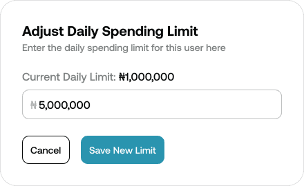
Adjusting a spending limit sits between the two. It is reversible but consequential, so it uses a focused input modal with a clear display of the current limit and a disabled save button until a new value is entered.
6. Merchant Category Controls
The merchant category restriction interface was designed around a simple mental model: selected means restricted, deselected means allowed. A strikethrough treatment on restricted categories reinforces this visually, making the current state immediately readable without requiring the manager to interpret colour alone.
1. Understanding the Problem Space
Before opening Figma, I spent time mapping out the core jobs-to-be-done for the business manager, identifying the information they need at each level of the dashboard, and listing the edge cases that could make or break trust in the platform.
The key questions I asked were:
What does this user need to see immediately upon landing on the dashboard?
What actions need to feel fast and reversible, and which need friction?
Where does the platform need to set expectations clearly to avoid confusion?
2. Competitive Research
I studied four leading card management dashboards: Brex, Ramp, Mercury, and Stripe Issuing. Each offered a distinct perspective on how to handle card management at scale.
Brex informed my information architecture, specifically the decision to centralise card status and spend limits in a single view
Ramp informed the spend utilisation visualisation, showing spent amount vs. limit as an inline progress bar in each card row
Mercury informed the visual tone, clean typography, generous whitespace, and a calm, trustworthy aesthetic
Stripe Issuing informed the side panel structure, keeping the card list in view while surfacing detailed controls for a selected card
3. Layout Decision: List vs. Grid
One of the earliest decisions was whether to display cards in a list or grid layout. A grid works well for consumer card apps where visual identity and personalisation matter. However, for a B2B manager overseeing multiple cards and comparing information across them, a table-based list view is significantly more scannable and efficient. The list view became the default, with the option to switch to grid as a secondary preference.
4. Information Hierarchy
I structured the dashboard around two levels of information:
Overview level - what the manager sees without clicking anything. Card status, cardholder name, card type, spend utilisation, and current balance. Enough to spot anomalies and make quick decisions.
Detail level - what surfaces when a specific card is selected. A side panel with full card metadata, spending limit controls, merchant category restrictions, and freeze or deactivate actions. All within context, without navigating away from the card list.
5. Action Design: Friction vs. Speed
Not all actions carry the same weight, and the design reflects that deliberately.
Freezing a card is reversible, so it requires a single confirmation step. The manager can unfreeze at any time, so the friction is minimal.
Deactivating a card is irreversible. Once deactivated, the cardholder must request a new card. This action is gated behind a two-step confirmation, first a plain language warning, then a password entry, ensuring the manager is fully aware of the consequences before proceeding.
Adjusting a spending limit sits between the two. It is reversible but consequential, so it uses a focused input modal with a clear display of the current limit and a disabled save button until a new value is entered.
6. Merchant Category Controls
The merchant category restriction interface was designed around a simple mental model: selected means restricted, deselected means allowed. A strikethrough treatment on restricted categories reinforces this visually, making the current state immediately readable without requiring the manager to interpret colour alone.
THE SOLUTION
THE SOLUTION
THE SOLUTION
The Relo Card Control Dashboard was delivered across two primary screens, supported by a comprehensive set of states, modals, and confirmation flows.
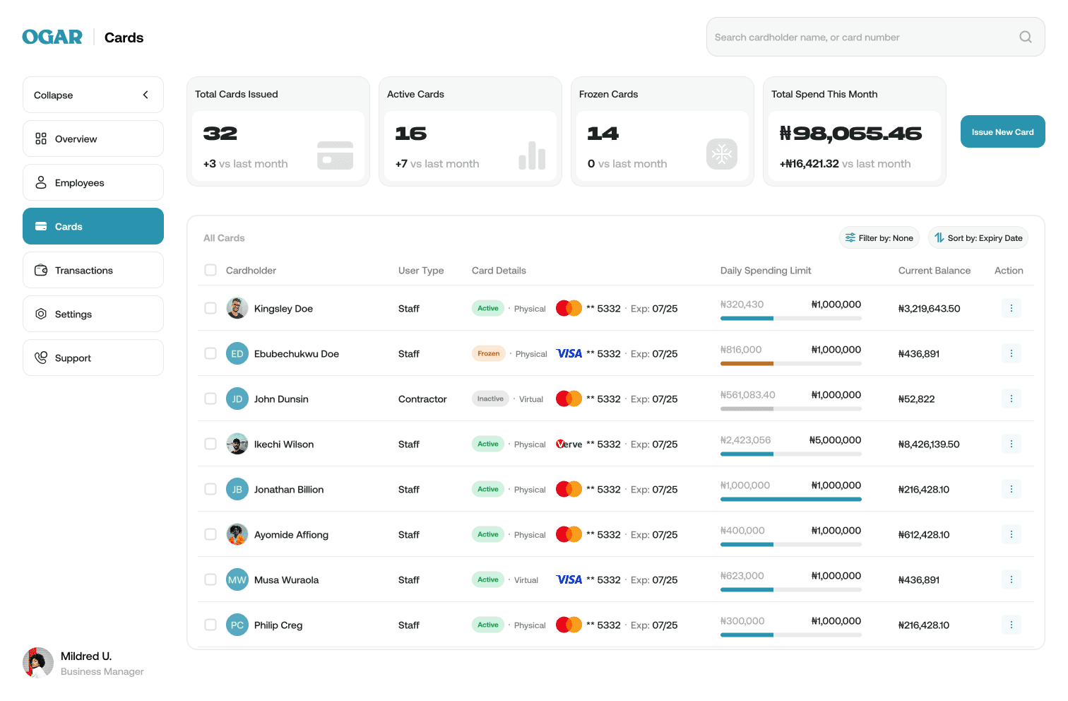
Screen 1: Card Overview
The Card Overview screen gives the business manager a complete, scannable picture of all company cards without requiring them to click into anything.
Summary Strip
Four stat cards sit at the top of the screen, giving the manager an instant health check on arrival:
Total Cards Issued
Active Cards
Frozen Cards
Total Spend This Month
Each stat includes a month-on-month comparison, helping the manager spot trends at a glance.
The Card Table
The main content area presents all cards in a table layout with the following columns:
Cardholder name and avatar
User type (Staff or Contractor)
Card details (network, last 4 digits, expiry, physical or virtual)
Daily spending limit with an inline utilisation bar showing amount spent vs. limit
Current balance
Action menu
The spend utilisation bar is a deliberate design choice. It allows the manager to visually identify cards approaching their limit without reading a single number, reducing cognitive load across a potentially long list of cards.
Card States
The overview accounts for four distinct card states, each visually differentiated:
Active (green badge)
Frozen (amber badge)
Inactive (grey badge)
Approaching limit (amber utilisation bar at 80%+)
Screen 2: Card Detail and Control
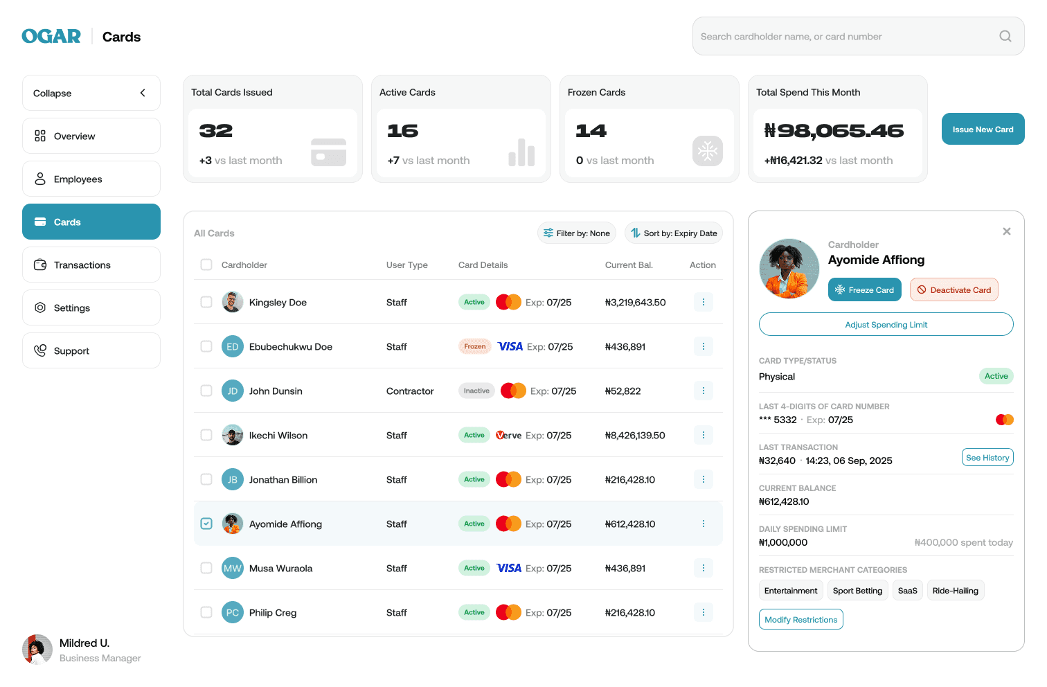
Selecting a card triggers a side panel that slides in from the right, keeping the card list in full view for context. The side panel is the control centre for all card-level actions.
Card Information
The top of the panel displays the cardholder's name, photo, card type, status, last 4 digits, card network, last transaction, current balance, daily spending limit, and restricted merchant categories. Everything the manager needs to understand the card's current state before taking any action.
Primary Actions
Three primary actions are available at the top of the panel:
Freeze Card / Unfreeze Card (context-sensitive, shows the relevant action based on current card state)
Deactivate Card
Adjust Spending Limit
Merchant Category Restrictions
A "Modify Restrictions" button opens a modal displaying all available merchant categories as selectable chips. Selected (restricted) categories are visually marked with a strikethrough. The manager can toggle categories on or off and save changes in a single action.
Confirmation Flows and Modals
Every consequential action is supported by a confirmation flow designed to set accurate expectations:
Freeze confirmation - a single modal with a plain language warning and an amber banner noting that pending transactions already authorised will still settle.
Unfreeze confirmation - a single modal confirming the cardholder will regain full access to the card.
Deactivation confirmation - a two-step flow. First, a plain language warning that the action cannot be undone and the cardholder will need to request a new card. Second, a password entry screen to confirm the action, with the same amber banner about pending transactions.
Spending limit confirmation - a focused input modal displaying the current limit and accepting a new value, with a disabled save button until the value is changed.
Success states - every completed action surfaces a success confirmation showing the card network logo, last 4 digits, and cardholder name, grounding the confirmation in the specific card that was acted on.
Edge Case:
Card Frozen While a Transaction is Awaiting Settlement
The Scenario
A business manager notices an unfamiliar transaction on an employee's card and moves quickly to freeze it. The freeze executes successfully. However, unknown to the manager, a transaction had already been authorised by the card network moments earlier and is now awaiting settlement.
Because card network rules mean an already-authorised transaction will still settle regardless of a freeze, the pending charge eventually clears, leaving the manager confused, anxious, and questioning whether the freeze actually worked.
This is a trust-breaking moment, and one that would typically generate unnecessary support escalations.
The Design Response
Rather than displaying a generic success state after a freeze, the dashboard surfaces a contextual warning inline at the point of confirmation, clearly distinguishing between two states:
Transactions blocked going forward, as a result of the freeze
Transactions already authorised that will still settle, regardless of the freeze
The warning appears as an amber banner within the freeze confirmation modal, with a direct path to dispute any suspicious charge.
This distinction is critical. Without it, the manager has no way of knowing whether a subsequent charge is a platform error or an expected network behaviour. With it, they have full context and a clear next step.
The Outcome
What could have been a trust-breaking moment becomes a trust-building one. The manager understands exactly what the freeze covers, feels in control of the situation, and knows precisely what to do next.
This edge case also applies to card deactivation, where the same amber banner appears in the confirmation flow, ensuring consistent behaviour across both irreversible and reversible card actions.
The Relo Card Control Dashboard was delivered across two primary screens, supported by a comprehensive set of states, modals, and confirmation flows.
Screen 1: Card Overview
The Card Overview screen gives the business manager a complete, scannable picture of all company cards without requiring them to click into anything.
Summary Strip
Four stat cards sit at the top of the screen, giving the manager an instant health check on arrival:
Total Cards Issued
Active Cards
Frozen Cards
Total Spend This Month
Each stat includes a month-on-month comparison, helping the manager spot trends at a glance.
The Card Table
The main content area presents all cards in a table layout with the following columns:
Cardholder name and avatar
User type (Staff or Contractor)
Card details (network, last 4 digits, expiry, physical or virtual)
Daily spending limit with an inline utilisation bar showing amount spent vs. limit
Current balance
Action menu
The spend utilisation bar is a deliberate design choice. It allows the manager to visually identify cards approaching their limit without reading a single number, reducing cognitive load across a potentially long list of cards.
Card States
The overview accounts for four distinct card states, each visually differentiated:
Active (green badge)
Frozen (amber badge)
Inactive (grey badge)
Approaching limit (amber utilisation bar at 80%+)
Screen 2: Card Detail and Control
Selecting a card triggers a side panel that slides in from the right, keeping the card list in full view for context. The side panel is the control centre for all card-level actions.
Card Information
The top of the panel displays the cardholder's name, photo, card type, status, last 4 digits, card network, last transaction, current balance, daily spending limit, and restricted merchant categories. Everything the manager needs to understand the card's current state before taking any action.
Primary Actions
Three primary actions are available at the top of the panel:
Freeze Card / Unfreeze Card (context-sensitive, shows the relevant action based on current card state)
Deactivate Card
Adjust Spending Limit
Merchant Category Restrictions
A "Modify Restrictions" button opens a modal displaying all available merchant categories as selectable chips. Selected (restricted) categories are visually marked with a strikethrough. The manager can toggle categories on or off and save changes in a single action.
Confirmation Flows and Modals
Every consequential action is supported by a confirmation flow designed to set accurate expectations:
Freeze confirmation - a single modal with a plain language warning and an amber banner noting that pending transactions already authorised will still settle.
Unfreeze confirmation - a single modal confirming the cardholder will regain full access to the card.
Deactivation confirmation - a two-step flow. First, a plain language warning that the action cannot be undone and the cardholder will need to request a new card. Second, a password entry screen to confirm the action, with the same amber banner about pending transactions.
Spending limit confirmation - a focused input modal displaying the current limit and accepting a new value, with a disabled save button until the value is changed.
Success states - every completed action surfaces a success confirmation showing the card network logo, last 4 digits, and cardholder name, grounding the confirmation in the specific card that was acted on.
Edge Case:
Card Frozen While a Transaction is Awaiting Settlement
The Scenario
A business manager notices an unfamiliar transaction on an employee's card and moves quickly to freeze it. The freeze executes successfully. However, unknown to the manager, a transaction had already been authorised by the card network moments earlier and is now awaiting settlement.
Because card network rules mean an already-authorised transaction will still settle regardless of a freeze, the pending charge eventually clears, leaving the manager confused, anxious, and questioning whether the freeze actually worked.
This is a trust-breaking moment, and one that would typically generate unnecessary support escalations.
The Design Response
Rather than displaying a generic success state after a freeze, the dashboard surfaces a contextual warning inline at the point of confirmation, clearly distinguishing between two states:
Transactions blocked going forward, as a result of the freeze
Transactions already authorised that will still settle, regardless of the freeze
The warning appears as an amber banner within the freeze confirmation modal, with a direct path to dispute any suspicious charge.
This distinction is critical. Without it, the manager has no way of knowing whether a subsequent charge is a platform error or an expected network behaviour. With it, they have full context and a clear next step.
The Outcome
What could have been a trust-breaking moment becomes a trust-building one. The manager understands exactly what the freeze covers, feels in control of the situation, and knows precisely what to do next.
This edge case also applies to card deactivation, where the same amber banner appears in the confirmation flow, ensuring consistent behaviour across both irreversible and reversible card actions.



OUTCOME & REFLECTION
OUTCOME & REFLECTION
OUTCOME & REFLECTION
What Was Delivered
The Relo Card Control Dashboard was completed as a comprehensive set of high-fidelity screens covering:
A fully populated Card Overview screen with four card states and spend utilisation visualisation
A Card Detail and Control side panel with all primary actions and card metadata
Freeze, unfreeze, and deactivation confirmation flows with edge case handling
A Merchant Category Restrictions modal with an intuitive toggle interaction
A Spending Limit adjustment modal with contextual guardrails
Success states for every completed action
A two-step deactivation gate for irreversible actions
Key Design Decisions
Looking back, three decisions defined the quality of this work:
Confidence over complexity. The temptation with a dense B2B dashboard is to surface everything. The discipline was in deciding what the manager needs at the overview level versus what belongs in the detail panel. Getting that hierarchy right made the difference between a dashboard that informs and one that overwhelms.
Friction as a feature. Not all actions should feel the same. Designing deliberate friction into irreversible actions, specifically the two-step deactivation flow, was a conscious decision to protect the manager from costly mistakes without slowing down time-sensitive actions like freezing a card.
Trust at the moments that matter most. The edge case around pending transactions was the most important insight in this project. Fintech products live and die by trust. A manager who freezes a card and still sees a charge clear has every reason to lose confidence in the platform. Designing for that moment, proactively and honestly, is what separates a thoughtful financial product from a functional one.
What I Would Explore Further
Given more time, there are a few areas I would love to push further:
Bulk actions — allowing a manager to freeze or adjust limits across multiple cards simultaneously, essential for larger teams
Spend analytics — a deeper view of spending patterns per card or per department, helping managers make proactive rather than reactive decisions
Notifications and alerts — proactive nudges when a card approaches its limit or when an unusual transaction is detected, reducing the manager's need to check in manually
Mobile responsiveness — a business manager is not always at their desk. A responsive or native mobile version of the dashboard would significantly expand its utility
Reflection
This project was a reminder that the best B2B design is not about making things look good — it is about making complex things feel simple, and high-stakes things feel safe. Every screen, every confirmation flow, and every piece of microcopy in this dashboard was in service of one goal: giving the business manager the confidence to act decisively, knowing the platform has their back.
What Was Delivered
The Relo Card Control Dashboard was completed as a comprehensive set of high-fidelity screens covering:
A fully populated Card Overview screen with four card states and spend utilisation visualisation
A Card Detail and Control side panel with all primary actions and card metadata
Freeze, unfreeze, and deactivation confirmation flows with edge case handling
A Merchant Category Restrictions modal with an intuitive toggle interaction
A Spending Limit adjustment modal with contextual guardrails
Success states for every completed action
A two-step deactivation gate for irreversible actions
Key Design Decisions
Looking back, three decisions defined the quality of this work:
Confidence over complexity. The temptation with a dense B2B dashboard is to surface everything. The discipline was in deciding what the manager needs at the overview level versus what belongs in the detail panel. Getting that hierarchy right made the difference between a dashboard that informs and one that overwhelms.
Friction as a feature. Not all actions should feel the same. Designing deliberate friction into irreversible actions, specifically the two-step deactivation flow, was a conscious decision to protect the manager from costly mistakes without slowing down time-sensitive actions like freezing a card.
Trust at the moments that matter most. The edge case around pending transactions was the most important insight in this project. Fintech products live and die by trust. A manager who freezes a card and still sees a charge clear has every reason to lose confidence in the platform. Designing for that moment, proactively and honestly, is what separates a thoughtful financial product from a functional one.
What I Would Explore Further
Given more time, there are a few areas I would love to push further:
Bulk actions — allowing a manager to freeze or adjust limits across multiple cards simultaneously, essential for larger teams
Spend analytics — a deeper view of spending patterns per card or per department, helping managers make proactive rather than reactive decisions
Notifications and alerts — proactive nudges when a card approaches its limit or when an unusual transaction is detected, reducing the manager's need to check in manually
Mobile responsiveness — a business manager is not always at their desk. A responsive or native mobile version of the dashboard would significantly expand its utility
Reflection
This project was a reminder that the best B2B design is not about making things look good — it is about making complex things feel simple, and high-stakes things feel safe. Every screen, every confirmation flow, and every piece of microcopy in this dashboard was in service of one goal: giving the business manager the confidence to act decisively, knowing the platform has their back.
Let's Build Something Great Together
Whether you have a role in mind or just want to connect, I would love to hear from you.
Get in touch
Let's Build Something Great Together
Whether you have a role in mind or just want to connect, I would love to hear from you.
Get in touch
Let's Build Something Great Together
Whether you have a role in mind or just want to connect, I would love to hear from you.
Get in touch